Page 1 of 2
Sandboxie GUI update
Posted: Thu Jun 23, 2016 7:07 pm
by Curt@invincea
We are considering updating Sandboxie's user interface. I would like feedback from the users as to what you consider important or unimportant in the current interface, and what you would like to see in a new interface. The goal is not merely to add fancy graphics, bells and whistles, etc., but to make Sandboxie cleaner, easier to use, more powerful, etc.
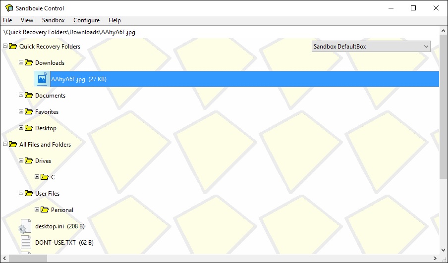
How many of you currently use "Files and Folders" off of the View menu? This same tree structure is available from Windows Explorer by drilling down into the Sandbox folder. But do you like to have it available in SbieCtrl, or should we just eliminate it?

- View1.jpg (87.29 KiB) Viewed 3434 times
Re: Sandboxie GUI update
Posted: Thu Jun 23, 2016 7:24 pm
by Mr.X
Thanks Curt.
Could you add these three options from:

to here?:

Re: Sandboxie GUI update
Posted: Thu Jun 23, 2016 7:35 pm
by Mr.X
Curt@invincea wrote:do you like to have it available in SbieCtrl, or should we just eliminate it?
I've never used this view, ever. Frankly I don't know whether it's a good idea to remove it or leave it to those who actually use it.
Re: Sandboxie GUI update
Posted: Thu Jun 23, 2016 8:31 pm
by bo.elam
Curt@invincea wrote:
How many of you currently use "Files and Folders" off of the View menu? This same tree structure is available from Windows Explorer by drilling down into the Sandbox folder. But do you like to have it available in SbieCtrl, or should we just eliminate it?
I never use the Files and Folders view and prefer to use Windows explorer when I want to see whats inside the Sandbox folder. I personally wouldn't miss that view at all if it was done away with.
Bo
Re: Sandboxie GUI update
Posted: Thu Jun 23, 2016 10:40 pm
by Special
Curt@invincea wrote:How many of you currently use "Files and Folders" off of the View menu? This same tree structure is available from Windows Explorer by drilling down into the Sandbox folder. But do you like to have it available in SbieCtrl, or should we just eliminate it?
I actually use this quite a bit, I like that I can right click a folder or file and have it "Recover to Same Folder", such as an ini file or whatever, it's also easier on the eyes then clicking through a maze of folders and juggling two or more windows using windows explorer. So I would stronger disagree with the removal of it, but it can use some quality of life improvements for sure.
I'll have more for suggestions later, but one that comes imminently to mind is to combine both the "Programs" and "Files and Folder" Views into one window for a given Sandbox, I really hate how I have to choose which one I want to see, there is so much dead space in the SB Control window that you can easily split a line down the middle and have the "Programs" View on one side and "Files and Folder" View on the other side, this would eliminate the tedium of having to switch between those two views.
Having more mouse control would be great too, what I mean is being able to drag and drop files out of Sandboxie from the Sandboxie Control window or double clicking on the folder/file would open a explorer window of the given location for quicker access.
Right clicking a file, there should be a delete button too! I would use this a lot, I'm shocked you have something like "cut" but not delete.
http://i.imgur.com/CPPfy5J.png
I guess the reason the people above me don't use this window much is because you can't do much with it, less then you can do with explorer anyway, it's also sorta clunky to use.
More info given to the user would be great too, but this is more added feature then streamline usability. an example would be
http://i.imgur.com/pHPASVt.png
Showing the user at quick glance what's new or something by highlighting, or just show a generic sort by creation/modified date list, I dunno.
Now for a selfish feature I would really love to see, this isn't really a Sandbox (Security) thing, but a way to view the RegHive natively, you could add this info to the "Programs" View stuff. Just something simple is all that is needed, after all Sandboxie is used to trap but also monitor how program interact, monitoring file creation is easy enough, but created reg keys is also important imo. Currently I use RegistryViewer v1.3 for this feature, but I'm trying to eliminate tedium for myself with is request by not having to load up and rely on 3rd part stuff in order to work with Sandboxie.
Peace Out.
Re: Sandboxie GUI update
Posted: Thu Jun 23, 2016 10:50 pm
by Special
Okay I just came up with another quick before supper

Right clicking the little taskbar Sandbox icon, there should be some kind of indicator of activity and whether it's empty or has files in it for each of your Sandboxes, something like this.
http://i.imgur.com/tIy8K89.png
Currently you have no way of knowing if your need to empty one out unless you manually check. The Green dot could mean that Sandbox is "active", a red could mean it's not active but there are files in it.
Re: Sandboxie GUI update
Posted: Fri Jun 24, 2016 1:29 am
by ssj100
I personally don't ever use the "Files and Folders" view. But it's not in the way really, and I'm sure there are people who do find it useful.
With regard to the GUI in general, I personally wouldn't want to see any updates or changes. I think it's as simple as it needs to be, and certainly doesn't need any "bells and whistles".
However, if you really feel it will add to your sales or what not, any changes made is unlikely to be a deal-breaker for me.
Just my opinions though.
Re: Sandboxie GUI update
Posted: Fri Jun 24, 2016 7:57 am
by henryg
How about a tabbed interface so I can have each sandbox in a separate tab; possibly with the option in each tab for files and folders for those that use it. Maybe different/multiple views for the same sandbox in separate tabs - now that would be good.
Ribbon style interface another possibility.
Re: Sandboxie GUI update
Posted: Fri Jun 24, 2016 9:19 am
by Craig@Invincea
Ribbon style interface another possibility.

Re: Sandboxie GUI update
Posted: Fri Jun 24, 2016 10:07 am
by Dun
Fix unfinished translations or remove those languages
Re: Sandboxie GUI update
Posted: Fri Jun 24, 2016 10:17 am
by Special
Tabs make sense as it would make for less clicking to switch between pages, 1 vs. 2 that it is currently. But Ribbon? Lets not make the clicks go from 2 to 5 please.
Re: Sandboxie GUI update
Posted: Fri Jun 24, 2016 11:37 am
by Curt@invincea
henryg wrote:How about a tabbed interface so I can have each sandbox in a separate tab; possibly with the option in each tab for files and folders for those that use it. Maybe different/multiple views for the same sandbox in separate tabs - now that would be good.
Ribbon style interface another possibility.
I'm working on tabs. Each sandbox will be in a tab window that you can position however you like to see real-time activity.
I'm not a big fan of ribbons. Especially with multiple languages.

I'm leaning towards an old-school toolbar. The fewer clicks the better.
Re: Sandboxie GUI update
Posted: Fri Jun 24, 2016 12:43 pm
by henryg
Curt@invincea wrote:henryg wrote:How about a tabbed interface so I can have each sandbox in a separate tab; possibly with the option in each tab for files and folders for those that use it. Maybe different/multiple views for the same sandbox in separate tabs - now that would be good.
Ribbon style interface another possibility.
I'm working on tabs. Each sandbox will be in a tab window that you can position however you like to see real-time activity.
I'm not a big fan of ribbons. Especially with multiple languages.

I'm leaning towards an old-school toolbar. The fewer clicks the better.
I'm not a big fan of ribbons either, but 1) I thought I'd throw in it there and 2) now and again for certain programs a non-ribbon interface feels a bit archaic. Good indoctrination from M$

Re: Sandboxie GUI update
Posted: Fri Jun 24, 2016 4:24 pm
by bo.elam
ssj100 wrote:
With regard to the GUI in general, I personally wouldn't want to see any updates or changes. I think it's as simple as it needs to be, and certainly doesn't need any "bells and whistles".
I agree with ssj100.
I think getting rid of the Files and Folders view is fine but would prefer major changes not to take place with the GUI. It works great the way it is, simple, no bugs. Perhaps adding the Tab design for individual sandboxes would be OK but I would rather most everything else to remain as is now.
Bo
Re: Sandboxie GUI update
Posted: Fri Jun 24, 2016 5:07 pm
by Curt@invincea
Ok, we will leave out the bugs.


